We are making paper in class! Each student will require 5 sheets of handmade paper, which will eventually transform into a book. Make sure pages are even and have the same texture in order to make your final work more cohesive.
Tricks to consider;
1) try to keep the pulp consistency the same for each sheet you make
2) use the same mould and couching material for each sheet (material has texture which will leave an imprint in your paper)
3) you may use different colours, but consider the end-product
MEANWHILE: If you have not finished your self-portraits, please finish at home. It is your responsiblity to get incomplete work done on your own time!
In class today, we continued looking at the similarities and differences between Art and Craft, one of the Applied Arts. Please read the attached mini-essay which gives us a historical perspective on these two categories and answer the questions attached below it. This is due tomorrow.
 | avi_201_arts_vs_crafts_reading.pdf | | File Size: | 188 kb | | File Type: | pdf |
Download File
| avi_201_art_vs_crafts_questions.pdf | | File Size: | 59 kb | | File Type: | pdf |
Download File
We are going to begin studio classes in several craft areas. The first one we are looking at is paper making, beginning tomorrow!
Some of you still need to submit their self portraits, as well as their Artist Statement!
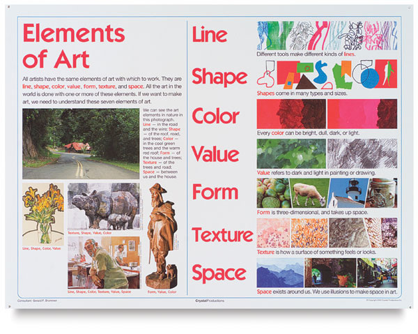
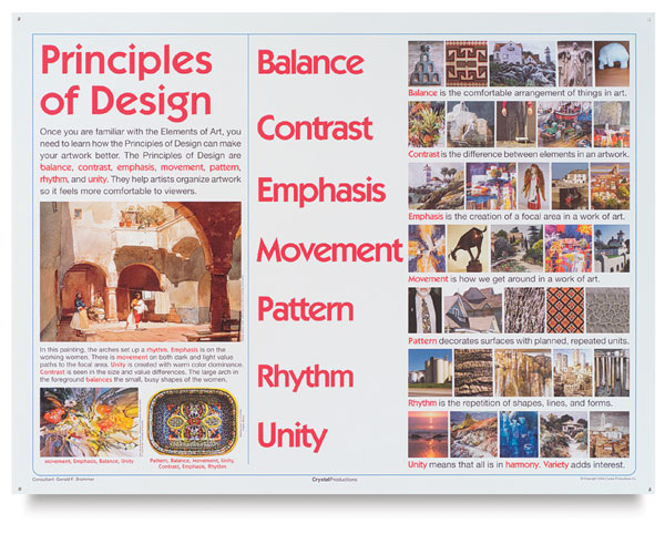
We began our new unit today, by examining art and craft items and establishing the differences. Art is art, because it pleases the eye, follows the Elements of Art and Principles of Design and its sole purpose is to be displayed and viewed. In doing so, it affects the viewer, both emotionally and mentally.
Applied art is all of that, except it has a functional purpose as well. It is intended for use.
Think of the Elements of Art and Principles of Design as you view the images in the PowerPoint. How do Art and Applied Art differ?
We viewed the following PowerPoint presentation in class and your TASK was to select one of the design activities at the very end and complete it with a partner.
 | fine_art_vs_applied_art_2010_3.ppt | | File Size: | 1944 kb | | File Type: | ppt |
Download File
A few of you have still not completed your self-portraits.
Your portait is MONOCHROMATIC, meaning one colour + its shades (adding black) and tints (adding white)
Your portrait symbol is COMPLEMENTARY, meaning in the opposite colour of your portrait (if the portrait is orange, your symbol should be blue). Your lightest area will be in that colour, and as you are darkening it, you are adding it's complement to it - the colour used in your portrait)
Your background is with either the tint (+white) or shade (+black) of your complementary colour. If your portrait is orange and your portrait symbol blue (with orange added to it, to darken it), the background should be blue tinted with white or blue shaded with black.
Once complete, please also include an artist statement, indicating why you have chosen the colours you have, as well as the portrait symbol.
Get cracking please!!!!!
You are also required to complete a written part to this assignment, which is a lesson in ART TALK, the textbook we use in class. You can do this activity when you aren't in the mood to paint, or when you are finished with all the other work.
TASK:
Please read ARTTALK (text) pp. 144-157 and answer "Check your understanding" questions on pp. 149 and 157
ARTIST STATEMENT:
You are also to submit a 5-10 sentence Artist Statement paragraph explaining the process behind your work, your choice of images (both self and sybmol) as well as colour. What does this work mean to you? What does it represent?
You are now creating your portrait.
TASK:
Select a colour which best represents who you are. The second page of the TASK handout has a list of the different colours and their symbolism in Western and Eastern societies.
You will create various TINTS and SHADES of this colour (8-10) and using this MONOCHROMATIC pallette, paint your portrait.
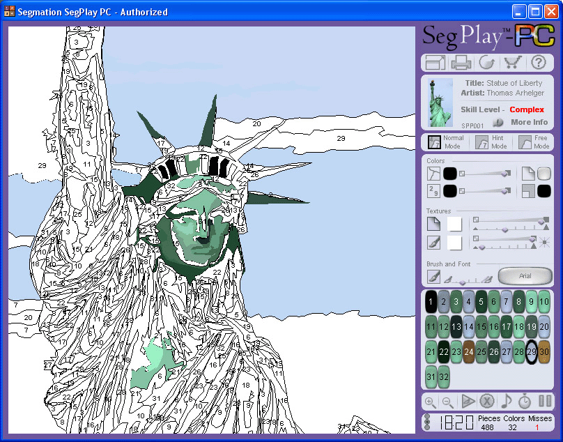
You have the various areas of differing value already isolated by contour line. As you are painting, make sure you are gradually blending the colours, so that your final work does not completely resemble a Paint by Numbers activity (seen below).
You will paint your PORTRAIT SYMBOL in your chosen colour's COMPLEMENT. EXAMPLE: if my portrait was in RED along with its SHADES and TINTS, my portrait symbol will be GREEN, and its variations less intensified by the addition of RED. This means that GREEN will be the lightest area on my portrait symbol, and GREEN mixed with the most RED will be the darkest area.
Makes sense? I hope so.
You will now think of a PORTRAIT SYMBOL that can represent who you are. Think about your interests, your hobbies, the one prevalent thing you identify yourself with.
Please click the button below to read about portrait symbols in art. 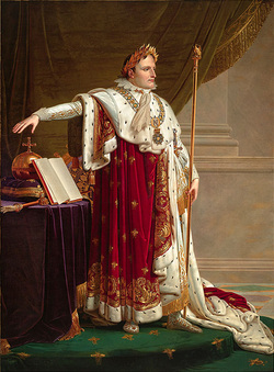 Anne-Louis Girodet, Napoleon I in Coronation Robes, c. 1804
TASK:
Draw this portrait symbol in high detail in your sketchbook and taking the sames steps as you did with your photograph, transfer the image onto the canvas. Make sure the two images visually interact. Think of the Elements of Art and Principles of Design.
You are to find a photo of yourself (can be recent, can be a younger version), which you will be working from. If you don't have a photo, I will take one of you with my crummy camera!
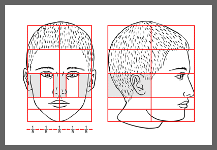
You will then draw yourself from the photograph, using the facial proportion measurements previously studied.
TASK:
1) you should enlarge this photo so that it fills a big part of a sketchbook page
2) you will first draw a light contour drawing adding the proportional divisions to assist you with the proper placement of your features. You may choose to use an acetate over your picture onto which you can actually draw the divisions using a permanent marker. This will help you transfer your image.
3) you will slowly add the details of your features and add value and texture with shading
* remember, the basic shape of a face is an upside down egg shape!
Once you have a detailed drawing, you will cover it with tracing paper and outline all the shapes (features, shadows, etc.) that you see on your image in a contour line. This will look a little like the drawing below, but with even more detail. Once you have finished tracing, you will turn the paper over and trace the tracing. Yes, you read it right. This way, when you place your drawing on the canvas, you can just trace over the original tracing once more and it will transfer the pencil on the otherside to the surface of the canvas. This will be the first part of you portrait.
Your task was to draw and Average Joe or Average Josie (you never know which one your drawing will turn out to be until you're finished!) in your sketchbook using the outlines of the proportions of the face as a guideline. After completing the drawing, your TASK was to find photo of a frontal face in a magazine, draw over the image with a pencil, outlining the proportional divisions and then transfer that image into your sketchbook. This should be finished for HOMEWORK.
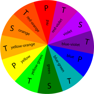
The attachment below is the the handout for this unit of study. We first looked at colour theory and each student was required to create a colour wheel in class. Click on the following for more information on the colour wheel. | avi_201_self_portrait_colour_theory_painting.pdf | | File Size: | 134 kb | | File Type: | pdf |
Download File
You will also draw 3 bars (2.3 cm by 20 cm) and divide each 5 ways on the same side of the paper with the colour wheel.
In the first bar, you will TINT (maker lighter, add white to) a HUE (colour) of your choice. Keep adding more white as you work down the squares. There should be a subtle change in the value of the colour.
In the second bar, you will SHADE (make darker, add black to) a HUE (colour) of your choice. Keep adding more black as you work down the squares. There should be a subtle change in the value of the colour.
In the third bar, you will experiment with colour INTENSITY by adding its COMPLEMENT to it. In the first square, you will paint your original HUE, in each square below, you will lessen the intensity by adding the colour opposite on the colour wheel. You should end with a brownish (almost black) HUE, which darkens the colour more naturally than if you added black to it.
Please complete for HOMEWORK in acrylic paint. Use only the PRIMARY colours to mix the others.
|

 RSS Feed